Collaboration Across the City

Here in Omaha, there is a spectacular teacher named Jane Langenfeld. Spectacular enough, in fact, to be named Nebraska’s Secondary Art Educator of the Year. Being as in awe of her as I am, I wanted to collaborate on a project between her students and my students. We decided to create artworks based on written descriptions provided by students from the other school. Jane was the brains behind the operation with this project, and almost all the ideas here are hers. I am the one with the blog, however, so I get to write about it :)

The original idea for this collaboration comes from an old Albrecht Durer etching of a Rhinoceros. You can check out the story here, but in short, the artwork was created based only on a written description about an animal that he had never before seen. We utilized this idea, and a youtube video called “Never Seen, Never Will” was incorporated into this lesson. Watch it here:

Jane and I began by collecting images on a secret Pinterest board. Which means I had to sign up for Pinterest–gross. But it worked well for this project, and I’m forced to admit that Jane was right. Whether I continue to see my time sucked away on that site, however, remains to be seen. We tried to find images that were visually interesting, with a few being out of the ordinary. Here are a few examples:

We had our students begin with the descriptions of the artwork, using basic descriptions without much analyzation or interpretation. We had them write with the knowledge that someone would be creating a drawing based on their description. The teachers stayed out of the way with the descriptions, but the authors did run them by other students to see if anything needed to be cleaned up or changed before an artwork could be completed.

Some kids took a very direct approach, stating only facts about placement of objects, backgrounds, colors, and anything else needed. Others had a more creative slant, like my student who gave her sculpture of an armadillo both a name and a personality (her writing was entitled “Po, the North Facing Armadillo, if North Happened to be to Your Left”).

I think the best part of this process, for the teachers at least, was seeing our teaching come through in the writing. Jane and I talked about how some of the phrases we use ourselves also showed up in their descriptions, how they referenced artists we discuss, and shared information the way we might share it as teachers. It’s nice to know that sometimes, at least, our kids are actually listening.

When the paintings were finished, we decided to exchange artworks. The day I went to deliver our work, it just happened to be during a random autumn ice storm; I almost died twice, but that’s neither here nor there. We got our works traded, and not long after, we were able to do our big reveal. We put the artwork in the hands of the original writers, and we recorded their reactions when they first saw the artwork that had been based on their writing. Take a look:

We did simple recordings and posted them to YouTube, while Jane had her students use an app called Explain Everything, as well as Voice Thread. Those two apps worked really well for them to explain exactly what they were talking about as well as showing the actual picture directly alongside the artwork. I would love to share those videos also, but I don’t teach there and don’t have permission and don’t want to seem stalker-ish. Here are a few of our artistic results, though, side-by-side with the original pieces that were used for the descriptions.

This was a really good project, and my kids very much enjoyed the experience. They loved the idea of collaboration, and they loved doing the writing (mostly). The artworks were a lot of fun for some–especially if there was a good description from which to work–and a lot of frustration for others. That being said, I think each of my students who participated would want to do it again. Here are some of our pictures next to the original images:

Lastly, I will leave you with a few outtakes from our critique sessions. They should not be taken seriously, by the way :)

Artwork of the Week, 11/24

2014-05-14 13.49.44


Andrea Madden

Lichtenstein Portrait

18 x 24″ Acrylic on Canvas

Drea took a small sketchbook assignment–draw someone you know in the style of Roy Lichtenstein–and turned it into a giant painting. The red dots were made with the eraser end of a pencil, in case you’re curious. The headband and the shirt need to be outlined with black, and the background may need another layer of paint, but we’re pretty close to being done here.

Social Issues Silhouettes

Silhouettes

I decided I wanted to try something new to begin the year with my advanced classes. I had been looking at the work of Kara Walker a lot this summer, and she served as the inspiration for these silhouette projects.

I was a little bit apprehensive, because her work deals with such controversial topics and the imagery can be disturbing at times. I spent a lot of time considering the images I would show, and I gave my students fair warning about what we would be seeing and discussing just so they were prepared. In addition, this was done with my juniors and seniors, so they were a little more prepared to deal with everything. That is not to say that this shouldn’t be done with younger kids–I don’t want to scare you off–but just a heads-up that you need your due diligence when you’re picking out images and discussion topics.

All of that being said, we let the discussion of Walker’s work slowly morph into a discussion about social issues.

What are the issues facing teenagers?

What are social issues we must deal with locally or nationally?

What issues are facing others in the world?

We went way more in-depth than that, but that would be a general outline from which we started. From there, students chose an issue that they felt strongly about. The personal reaction is key here, so they have the passion to make this work successful.

The Process

Once students had their issues selected, we began brainstorming and sketching to determine what kind of imagery we would need–with no words allowed. After sketches were made, I had students show their ideas to friends, family, teachers, and whoever else they wanted. The litmus test is this: if viewers can understand your work, and which issue you are presenting without explanation, you are good to go. If you have to explain it to the viewer, your image needs to be reworked. You keep reworking until your voice and your image present exactly what you want to the viewer. Once students have that clear, powerful visual, they are ready to move on to finalizing images on their project paper.

Choices in composition are key here, and students MUST work out the finer details and smaller parts of the project before they get started. Whether they are cutting out the silhouette or coloring it with a Sharpie, if they are lacking in attention to detail the project can be derailed.

Most of my kids chose to utilize the markers–I think it’s a comfort level thing–but the exacto knife masters did a pretty nice job with their work as well. I can’t recommend one over the other, so I’ll recommend that you give the kids a choice–I promise they’ll appreciate it.

Hopefully they accomplished what they set out to do. If any of the images need explaining, feel free to leave a comment and I will go back to yell at them :)


Artwork of the Week, 9/2

2014-09-03 10.06.31


Haley Walter

Skeletons and Flowers, 8 x 22″, Graphite and Pastels

This was just a quick project with Drawing I that turned into something spectacular. We tried juxtaposing skeletons and bones with fake flowers and ribbons–I swear there’s a Georgia O’Keeffe tie-in here somewhere–and we got some pretty cool works out of it. I gave students a choice of graphite with pastels for a softer look, or all markers (black Sharpie with other colors) for a harder-edge drawing. Haley’s was the best of the bunch, and a really successful result for a first project in Drawing I.

Longo Pictures 2014

So, you can see the full version of this lesson here, and my condensed version over on The Art of Ed as my first article. We went outside today to throw, jump, dodge, and take pictures of it all.

By the way: it was 95 degrees with about 90% humidity today, so apologies in advance for the visible pit stains and dripping sweat in all of the pictures. Sorry you have to see that :)

Paint Fight

DSCN2543

So, you may have been seen our Paint Fight Gallery and wondered exactly what my students are able to get away with in class these days. Well, a lot, actually, and we had a great time doing it.

The impetus for this was a discussion in class on how to make portraits more interesting. We thought it would be a great idea to do portraits of people covered in paint. Unfortunately, there’s really not time to cover each other in paint during the normal school day, so we had to wait until summer school to pull this off. It was totally worth it.

To begin, we looked at Jackson Pollock:

And Yves Klein’s Anthropometries (human paint brushes–some of which are naked, but it’s tasteful. Don’t watch if you’re worried about naked people):

We then got our paint ready–a lot of watered down acrylic and tempera. We also punctured some holes in small containers of paint so we could drip color out of the bottom, a la Jackson Pollock. A few brushes, some large butcher paper to create our paintings, and we were just about ready to go.

DSCN2541


We did have to make a couple of wardrobe alterations, however. We lost socks and shoes, glasses, and anything in our pockets (paint soaks through and covers anything inside of your clothes). Allyah needed to come up with a hijab that she could ruin with paint stains. It happened to be an old white t-shirt that she stapled together so it would hold.

DSCN2540


Jo altered her shirt to say “Train through the Paint”–seems appropriate.

20140611_081612

Then it was time to head outside and go crazy with the paint. We had three rules:

  • No paint on the concrete (sidewalks and parking lot)
  • No paint on the school exterior
  • No paint on the cars parked near our painting space

Other than that, everything else was fair game, and we had a great time throwing, painting, dripping, and generally just making a giant mess.

Nicole was our first victim:

And then it was Katie:

I think these before and afters are a good illustration of exactly what happened to everyone:

When we were done, everyone posed for formal portraits. I’m actually pretty excited how they turned out. A few of the close up head shots:

And a few of the full-body poses were pretty cool as well:

Those who spent time cleaning up REALLY spent some time cleaning up, going so far as to sit in our sink. A few people, like Jo, decided to just move on with our day covered in paint :)

Now, we are on to the drawings of these spectacular photos, which will be the end result of all this craziness. I can’t wait.

Romance Novels

2014-04-24 15.32.18


“Bruce never expected to find someone to love. Robin was his only friend and well, he just wasn’t his type. Yet one day, the unexpected happened. When Bruce met Peter, they clicked automatically. It was something more than just heroic companionship. Alas, they were from different universes; it was not meant to be. Will Bruce be able to bridge the gap that separates their world, or will the DC Universe hold him back? What will happen when the masks are taken off?”

We did this WAY back at the beginning of the semester, but I haven’t posted about it until now; I figured it would be a great end-of-the-year activity if you need to fill a couple days.

The idea: Students work in groups to place popular characters on romance novel covers. They create a title for the book, draw the cover, and write a synopsis that describes the plot.

I came up with a list of about 60 characters–if you want a copy, just let me know–ranging from superheroes (think Spiderman, Batman, Superman) to cartoon characters (Snoopy and Charlie Brown) to TV characters (The Simpson, Family Guy) and Disney characters (Princesses, The Beast from Beauty and the Beast, Prince Charming). Each group drew 3 names at random–they could choose 2 of the 3 for characters, or all 3 if they wanted to create a love triangle. They then needed to figure out the plot and take it from there. One day for planning, one day for drawing/coloring/writing. It could be a lot of fun on Photoshop as well.

Quick note: I do groups of “two-ish” when we divide up. Don’t remember where I got the idea, but it works well. Most groups will have two, some will have 3 if they don’t want to exclude someone, and people can work alone if they don’t like groups or are just anti-social :)

My other favorite was this one, with Shaggy and Aquaman:

2014-04-24 15.31.22

 ” A group of kids take up the investigation of a strange and surreal mystery that has frightened children all along the coast. One of the group members, Shaggy, becomes separated from the gang, only to run into this mysterious man. It’s love at first sight, and this starts Shaggy’s epic love ride as the mystery man whisks him away. As their venture ensues, his love becomes known as Aquaman, a man with powers only useful in the sea. Will true love hold through their transatlantic journey, or will problems manifest to take away their mutual feeling of oneness?”

Great stuff. Here are a few final covers:

Layered Tape Paintings

DSCN2467

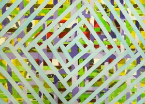
I totally stole this lesson from Andrea Slusarski, my favorite teacher from Colorado. You should read about her lesson here.

Basically, it’s a matter of painting, adding tape, painting more, adding more tape, and on and on. At the end, the tape is removed to reveal the layered designs. It’s simple, but very, very cool. We painted on cardboard, I adapted my lesson to fit my current semester of students, and it went like this:

Our layers:

  • Base Coat
  • Monochrome–any subject, but a wide variety of values
  • Nature or Landscape
  • Texture
  • Black and White, possibly incorporating writing (song lyrics, poem, book passage, etc.)
  • Choice
With all of our projects, we have a 5-objective, 5-point rubric we use to grade, and the objectives are individualized to each project. Here’s what my kids and I came up with for these paintings:
  1. A wide variety of subjects and techniques
  2. Purposeful designs created with tape
  3. Appealing color scheme
  4. Precise lines created by tape
  5. Precise lines used when painting
They had a blast personalizing, coming up with concepts and themes that continued from layer to layer, and of course seeing the results when it came time to take off tape.

Acetone Transfers

I was sitting here the other day, thinking to myself about how long it’s been since I’ve let my students play with toxic chemicals. I figured we needed to rectify that, so I decided to spend a little bit of time with acetone transfers.

If you aren’t familiar, it’s the process of taking a black and white photocopy, placing it face-down on another piece of paper, and rubbing acetone on the back. After burnishing the back of the original paper, it leaves a reversed image on the second piece. I had seen the process previously, but never actually done it, so I was experimenting and somewhat flying blind. Nevertheless, it was fairly easy. I’m obviously not an expert, but I thought I could share what I’m experimenting with.

Step One: Take some pictures

I used the Google App called Webcam Toy to take photos in the black and white setting, but I think any photo editing software can get you to a simple black and white image. You can choose to reverse it for the transfer.

Here’s the picture I used of Lindsey, the other art teacher in my room. We’ll be seeing a lot of it today:

webcam-toy-photo1 (1)


Step Two: Print/Copy

Inkjet printers DO NOT work for acetone transfers. Everything else does–it’s the toner from the printer or copier that transfers, so you can either print or copy the image. Make a few, because you will likely need more than one.

Step Three: Create a Background

I’m totally unsure of where I’m going with this project, so I decided to create a bunch of 6 x 7″ backgrounds on which I could transfer the images. I decided on watercolor, acrylic, marker, pastel, a book page, a map, and colored pencil.

Step Four: Transfer the Image

Your Weapons of Choice: Your image and background–obviously–along with tape, acetone, paper towels (or cotton balls or q-tips), and a spoon or other tool with which to burnish. Open some windows or get some masks; this stuff smells. Rubber/Latex gloves would be handy, but not necessary.

20140402_094059

Tape your image face down so it does not move when making the transfer. Add some acetone to the paper towel, then begin rubbing the acetone on a small area of the image–the paper becomes transparent when the acetone is added, so you know which areas you have already covered. Then burnish the area with your spoon or other tool to fully transfer the image. Work in small sections until the whole image has been transferred.

Step Five: Reveal the Image

After you remove the tape, slowly peel of the original image. If it is stuck, which it may be, just add a little more acetone and it should come off fairly easily.

My Results

As aforementioned, I tried out a few different backgrounds with that image of Lindsey. Here’s how they turned out:

2014-04-01 12.36.00

Pastel: Solid but unspectacular. Not a lot different than just printing on regular paper, but you could easily mix colors to create a more interesting background.

2014-04-01 12.36.19

Colored Pencil #1: No. Just no.

2014-04-01 12.36.09

Colored Pencil #2: No again. I thought the first might be an anomaly, but I failed miserably a second time. I think the wax in the colored pencils offers too much resistance for the ink to transfer well.

2014-04-01 12.36.27

Acrylic: Our third no. Again, there is some resistance here, and the acetone pulled up some of the paint. It’s not gonna fly for us.

2014-04-01 12.36.37

Watercolor: This is good. This we can work with.

2014-04-01 12.35.53

Marker: Marker! Love this!!! The image transferred really well, and the acetone created some great effects in the marker to add some textured background. I went back in later with acetone on a crumpled paper towel to create more texture.

20140402_094702

Page from a random crime novel? Yes.

20140402_094713

A Florida map, with St. Petersburg as Lindsey’s nose? Yes again.

So, we’ve got four good images, one meh, and three that just didn’t work at all. See? Told you I’m no expert.

The question, then, is where do I go with this? I have a lot of ideas running around my head, but I’m not enthralled with any of them. I want it to be more than a two day project that kids have a lot of fun with, but I’m not sure where we can find something meaningful here. If anything jumps out at you, shoot me an e-mail or leave me a comment. I’d appreciate it :)

Other Thoughts

Webcam Toy is fantastic. There are something like 80 filters, and they’re fantastic. So many ways to alter images, it’s fun to take pictures, and there are so many projects that could come from the effects that are there. Just be warned: After you get into it, it can be a rabbit hole. It’s way too easy to waste two hours playing around taking selfies (and I hate taking selfies).

When you’re burnishing, press hard. Small, circular motions work best.

In that same vein, work small. It takes a long time to burnish well, and full-page images are maybe not the best.

Lastly, you can sometimes get a second “ghost” image by doing a second transfer, but only one good one for each photocopy. I’ll leave you with a picture of an original transfer with a second one next to it.

20140402_094110

We’ll see where we go from here!

Artwork of the Week, 2/17

2014-02-12 10.52.09


Madeline Bishop

Randi

11 x 14″, Graphite

This is one that comes from our Smashing Faces project. I love how the nose and lips are pressed so hard against the glass, but the eyes still project this look of fear and wonderment. Madeline has been in art for less than a year, but she’s obviously doing some great stuff.